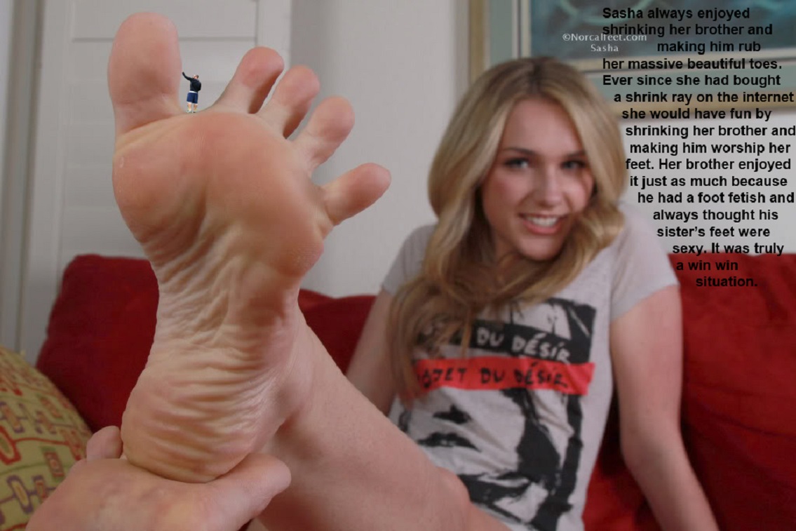
This actually brings up a good point. "Images" in this style always kinda bug me. The style I mean is, taking a collage like this and simply imposing a little text blurb over it like that. I can't put my finger on why, but the juxtaposition creates an incredibly lazy feel, like the creator started with the story (which in my experience, is usually not well-written) and then superimposed it on top of a fairly generic collage made of one part stock giantess and one part stock micro.
I've seen collages of similar quality, only they used text bubbles instead of raw text, and for some reason those ones just seem overall... better. Like, somehow using text bubbles instead of block text makes it seem like the speech is closely related to the image content, instead of the image being an afterthought. The whole thing just feels integrated, as if it were one singular piece of art instead of two (or three, in the case of exceptionally poor quality) separate pieces simply glued together.
Maybe I'm thinking too hard?
|


